A small business owner was proud of the sleek new contact form on their website. It looked modern — just a few clean, empty boxes with light grey text inside them, like "Your name" and "Your email," disappearing the moment someone started typing.
A few weeks later, a customer using a screen reader (special software that reads website content aloud for people with visual impairments) mentioned they couldn't figure out what most of the boxes were even asking for. The software simply announced "edit text, edit text," with no idea what information belonged where.
Around the same time, another visitor said they accidentally left a box empty because they forgot what it was for the moment they clicked into it, since the hint text vanished.
Nothing was technically broken. The form still worked. But something important was clearly missing.
Let's understand what it really means.
What Are Form Labels?
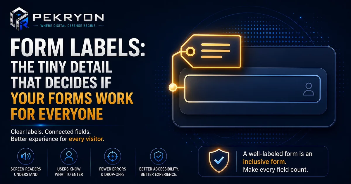
A form label is the visible, permanent text that tells a visitor exactly what a specific box on a form is asking for — like "Full Name," "Email Address," or "Message." Unlike placeholder text (the light grey hint that sits inside a box and disappears once you start typing), a proper label stays clearly visible the entire time, and it's also connected in the website's code directly to that specific box.
Think of it like the printed label on a jar in your kitchen versus a sticky note written in disappearing ink. The printed label stays put no matter what you do with the jar. The disappearing note might look fine for a moment, but the information vanishes exactly when someone needs to double-check it.
Why Should You Care About This?
- Accessibility — screen readers rely on properly connected labels to announce what each box is for. Without them, visitors relying on screen readers may have no idea what information a box wants.
- Usability for everyone — placeholder text alone disappears the moment someone starts typing, so if they pause or come back later, they may forget what a box was asking for.
- Fewer form errors — clear, permanent labels reduce mistakes like leaving required fields blank or entering the wrong kind of information.
- Professional trust — forms with proper labels feel more polished and easier to use.
Where Do You See This in Daily Life?
- Clicking into a box and instantly forgetting what it was asking for, because the hint text disappeared
- A screen reader announcing a clear field name like "Email address, edit text" versus a vague "edit text" with no context
- Feeling confident filling out a form because every box clearly says what it wants
- Abandoning a confusing form halfway through because you weren't sure what a particular box needed
How Does It Actually Work?
In a website's code, a form label is usually written as its own separate piece of text and then deliberately connected to its matching input box using a specific attribute. This connection is what allows screen readers to correctly announce the label whenever a visitor moves into that box.
Here's an important nuance worth understanding: placeholder text and a proper label are not the same thing, even though they can look similar visually. Placeholder text sits inside the box as a light hint and disappears once typing begins — it is not reliably read by all screen readers, and it offers no help once the box is filled in or revisited. A proper label stays visible at all times and is directly linked in the code, making it dependable regardless of what's typed or how someone is browsing.
A well-built form often uses both together — a clear, permanent label for reliability, and placeholder text as a small additional hint, like an example format.
Common Examples
- A signup form uses only placeholder text inside each box, and several users end up submitting empty or incorrect entries after getting distracted mid-form.
- A contact form uses clear, permanent labels above each box, alongside light placeholder text showing an example format, making it easy and reliable for every visitor.
- A checkout form relies solely on icons with no text labels at all, leaving many visitors unsure what some fields are even asking for.
Benefits of Using Proper Form Labels
- Makes your forms genuinely usable for visitors relying on screen readers
- Reduces confusion and incomplete or incorrect form submissions
- Builds a small but real sense of trust and professionalism in your website
- Supports better overall usability
Risks or Limitations to Understand
- Adding labels alone does not fix every accessibility issue on a form
- Labels placed far away from their matching box, even if technically present, can still confuse visitors visually
- Relying only on placeholder text removes a dependable cue the moment typing begins
- This fix specifically improves form clarity — it doesn't directly affect unrelated areas like page speed or design style
Common Mistakes Beginners Make
- Using only placeholder text and assuming it's the same as a proper label
- Leaving labels unconnected in the code, so screen readers can't correctly announce them
- Removing labels for a "cleaner look," without realising the usability cost this creates
- Not noticing the issue at all until a visitor or customer points out the confusion directly
Beginner Tips
- Add a clear, permanent label above or beside every form field, rather than relying only on placeholder text.
- Connect each label to its matching field in the code, so screen readers can announce it correctly.
- Use placeholder text as a bonus hint, not the only guide.
- Test your own form by clicking into each box and pausing, to see if you'd still remember what it's asking for.
- Review your existing forms periodically, since new forms added during updates are often built without proper labels.
Manual Check Guide: How to Check This Yourself
- Open a page on your website that has a form, like a contact or signup form.
- Click into the first box and start typing a few letters, then delete them.
- Notice whether any text remains visible above or beside the box once it's empty and you've clicked away. If nothing stays visible, that box likely only has placeholder text, not a proper label.
- For a more technical check, right-click near the form field and choose "Inspect" to view its code.
- Look for a
<label>tag connected to that field, or aforattribute matching the field'sid. If you see this connection, a proper label is likely in place. - Repeat for each field on the form to see how consistently labels have been used.
This takes just a couple of minutes and works on any website, including your own.
Frequently Asked Questions
1. What is a form label? It's the visible, permanent text that tells a visitor what a specific form field is asking for, connected directly to that field in the website's code.
2. Is placeholder text the same as a form label? No. Placeholder text is a light hint inside the box that disappears once typing begins, while a proper label stays visible at all times and is dependable for every visitor.
3. Why do screen readers need form labels specifically? Screen readers rely on the code connection between a label and its field to correctly announce what that field is for. Without this connection, they may announce something vague or nothing useful at all.
4. Can I use both a label and placeholder text together? Yes. Many well-built forms use a permanent label for reliability and placeholder text as an additional hint, like an example format.
5. Does removing labels for a cleaner design always cause problems? It often does, since visitors lose a dependable cue about what each field wants, especially if they pause or return to the form later.
6. Do form labels affect my website's SEO? Not directly in a major way, but a more usable, accessible website generally supports better overall user experience, which search engines do value.
7. How can I check if my forms are missing proper labels? You can test by clicking into a field and checking if any text remains once it's empty, or inspect the form's code directly for a connected label.
8. Is this only important for contact forms? No. Any form on your website — signup forms, checkout forms, search boxes, and more — benefits from clear, properly connected labels.
Conclusion
The story of the disappearing hint text and the confused screen reader shows how something as simple as a form label can quietly shape whether visitors complete your forms confidently or give up halfway through.
Fixing it is straightforward once you know what to look for. A clear, permanent label on every field, properly connected in the code, goes a long way toward making your website genuinely easy to use for everyone.
If you'd like to see how your own website's forms are set up, you can run a quick, free check at pekryon.com and review this along with other technical details about your site.